Responsive Web Design
A web design that adapts to the screen size.

Web Design from Cologne

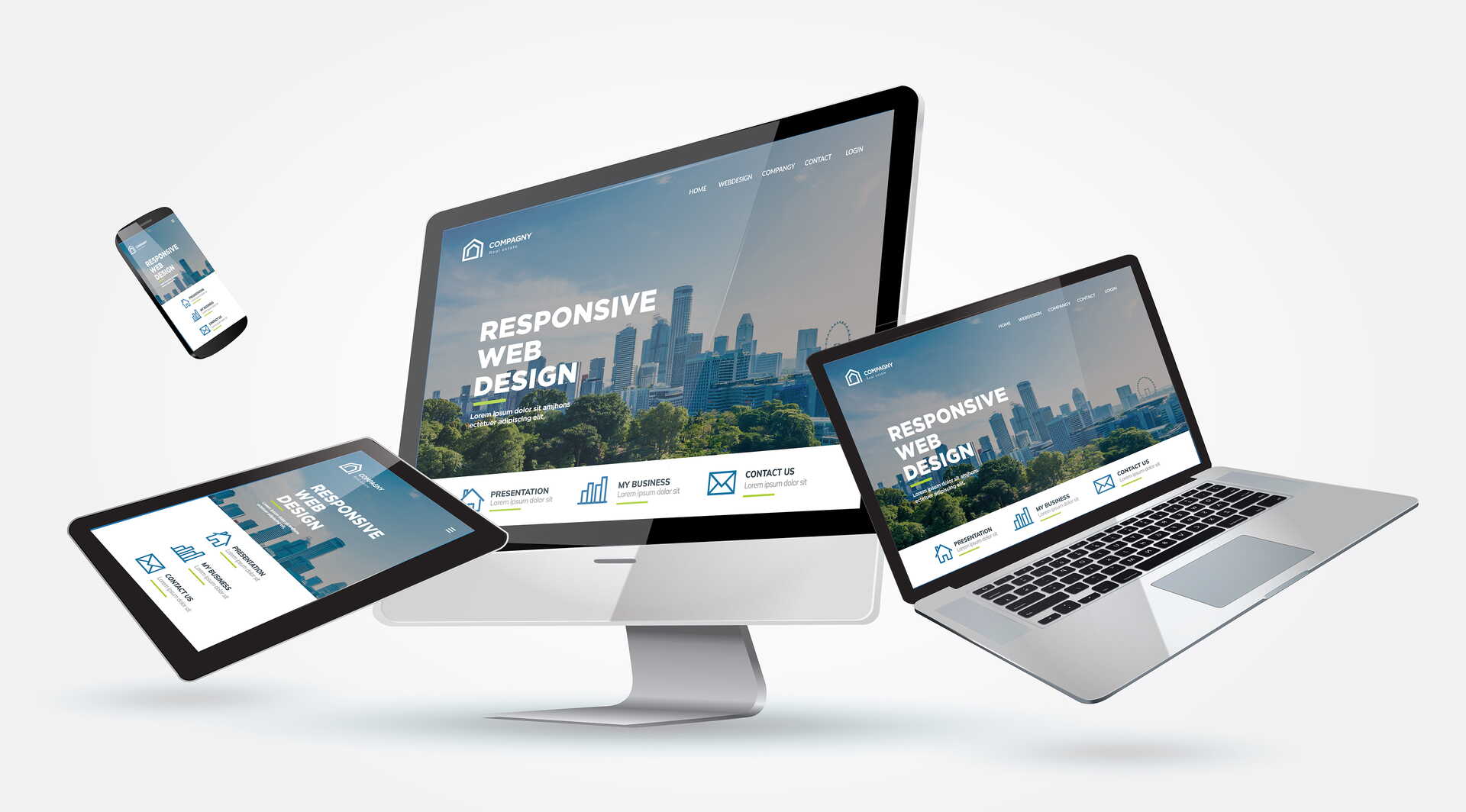
A web design that adapts to the screen size.

While the layout of a catalogue or a flyer is set once and then stays that way forever, the content of a web design has to look good on different devices. Not two websites – one for desktop, one extra for the phone – but one HTML that reflows. Breakpoints sit where the content tips over, not at a device name.
Viewing a website on a phone is standard. The same content landing on a wristwatch is unlikely, but possible. So the layout adjusts dynamically to the width.
On a phone, people either keep reading or they leave. Tiny tap targets, text that spills sideways, forms you cannot fill in: that costs enquiries. Google also indexes the mobile view first – a page that fails on a phone ranks worse on a large screen too.
Not just “the image gets narrower”. Navigation (often a burger), type size, images, tables and forms each need their own rules. What simply stacks in a text-and-image column has to be decided deliberately elsewhere.

Where text and image merely sit side by side, the fix is usually simple: stack them. With text on an image, the choice depends on the content:
A separate mobile-only domain, buttons under 40 pixels, 4000-pixel hero photos in a narrow column, content that exists only on desktop. How images should be delivered is on Images & videos for websites.
I set breakpoints from the content, not from “iPhone” or “desktop”. Testing happens on a real phone, not only on the slider in the browser. Contao and Shopware are the tools – what happens at which width stays handmade.
If your website struggles on a phone or you need a new one: how a project runs – or write to me via the contact page.